Dawn Research, Strategy & Packaging Design
Dawn Dishwashing Liquid was faced with their main competitor, Palmolive, winning in the war against superior grease cleaning, specifically soaking dishes first.
As Dawn had always been the leader in grease cleaning, the brand had to act quickly to regain their superior position over the competition. To reestablish their superior grease cleaning equity, Dawn improved their formula and looked to help communicate their product’s innovation on shelf. Need was determined for an evolutionary design to help drive trial and consumer interest. A category audit was conducted to help differentiate Dawn’s positioning at shelf.
The Goal
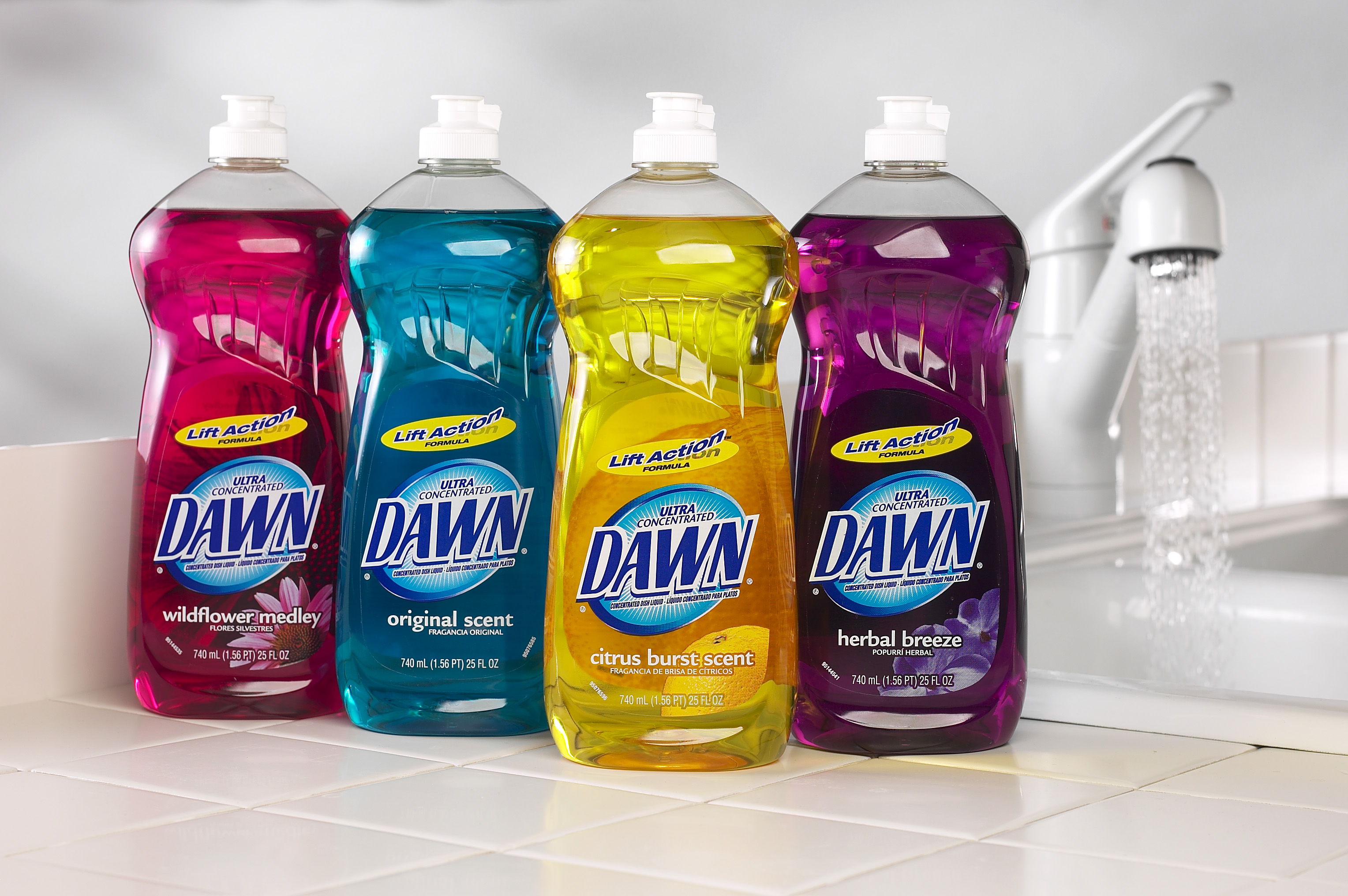
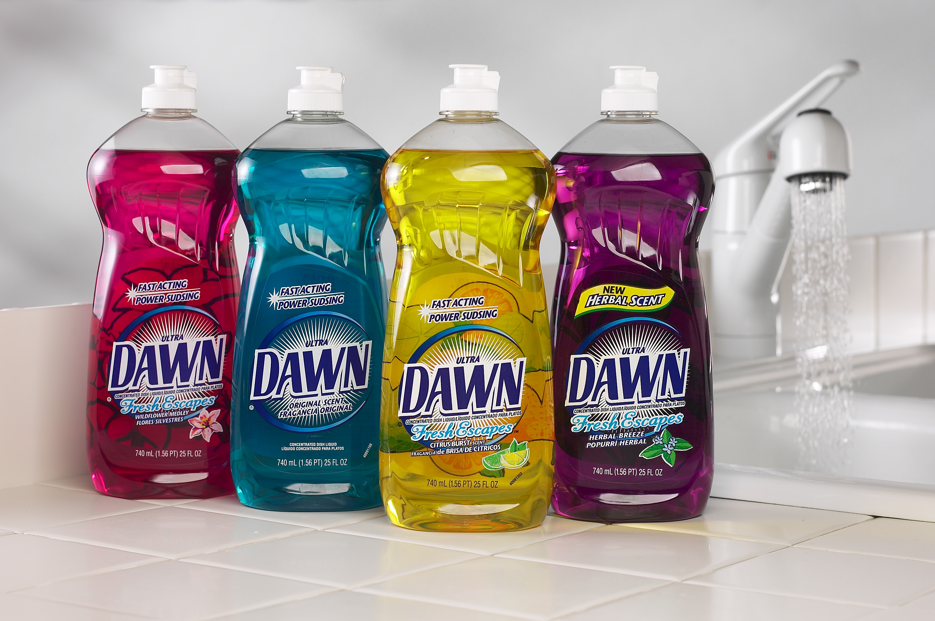
Simplify the communication to help stand out from the clutter, which resulted in a very focused beauty care approach to the scent names, imagery and overall look and feel.
Approach
The team then developed a powerful Lift Action formula icon, in addition to bringing the core dawn blue equity color behind the logo to help communicate the products efficacy and new/improved formula to consumers. Bringing the blue into the logo also created a strong brand blocking on shelf and First Moment of Truth.
Results
The new Dawn packaging saw immediate impact with increased shipments and distribution in Wal-Mart and Club (which account for approximately 45% of total Dawn sales).