Process Example
When approaching a new project, I don’t rely on rigid steps, cookie-cutter processes, or formal project gates. Some challenges demand quick, decisive solutions, while others require deeper exploration and innovation. When the path forward isn’t clear and greater structure is needed, this is the process I follow.

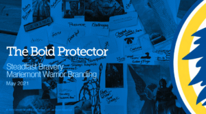
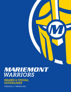
Strengthening the Mariemont Brand
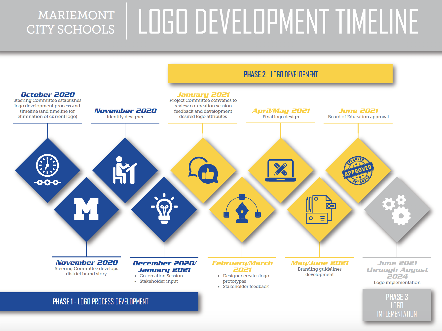
While I share the finished work from many of my previous client projects, much of the strategy and process behind them remains confidential and cannot be publicly displayed. However, the 2021 rebranding project I led for Mariemont City Schools is one I can share, offering insight into how I approach significant rebranding efforts. Previously, I led the rebranding efforts in 2012 to differentiate the previously used stock artwork logo with a new, more contemporary version.
Visuals are powerful—instantly understood and emotionally resonant. In a school district, a brand carries an even deeper meaning because they connect to people’s sense of home, family, and educational pride. Mascots and symbols aren’t just design elements; they become a part of daily life and community identity.
This pro bono initiative illustrates how I guide significant identity projects—from unknown and complexity to clarity and action.
Situation
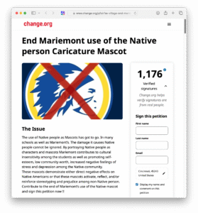
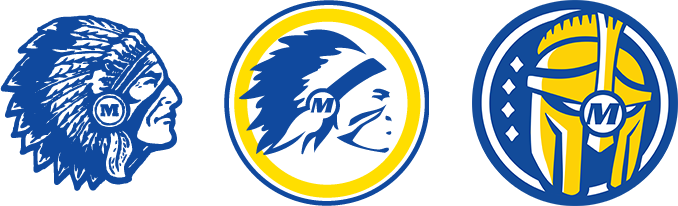
Mariemont City Schools faced growing concern from alumni and community members regarding the use of Native American imagery in its branding. A public petition called for the removal of these representations, stating:
“The damage it causes Native people cannot be ignored. By portraying Native people as characters and mascots, Mariemont contributes to cultural insensitivity among students and promotes low self-esteem, decreased community worth, and increased negative feelings of stress and depression among Native communities. These mascots demonstrate either direct negative effects or reinforce stereotyping and prejudice among non-Native individuals.”
The district recognized the need to address these concerns with a respectful, forward-thinking rebrand that honored both tradition and change.
Task
The challenge was to retain the iconic “Warrior” name—seen as a legacy element—while removing harmful cultural references and developing a more inclusive, unifying identity. We needed to redefine not just the visuals, but what the Warrior meant—ensuring the new brand would reflect the district’s values of honor, courage, and excellence.
- Maintain a blue and gold color scheme in the logo design.
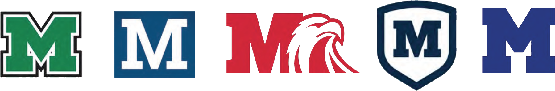
- Avoid the use of a block “M” in the logo design as it is too similar to other schools in the area.
- Contain the logo design within a circle.
- Do not incorporate additional colors (beyond blue and gold) into the logo design.
- Create a logo design that is a mascot/image rather than typeface/letters only.
- Find a way of incorporating the four communities (Fairfax, Mariemont, Terrace Park, Williams’ Meadow) into the logo design.
- Keep the logo design gender neutral.
- Avoid the use of any Native American imagery/artifacts in the logo design.
- Create a logo design that is simple and/or abstract.
- Create a logo design that is unique to the region.
- Create a logo design that is classic and traditional.
- Create a logo design that is bold and dynamic.

Action
 We began by involving a broad range of stakeholders—students, parents, educators, alumni, and administrators. Through open forums, workshops, and feedback sessions, we explored:
-
What the word “Warrior” meant to different people
-
Which emotions and qualities it should represent
-
How to capture those values in visual form
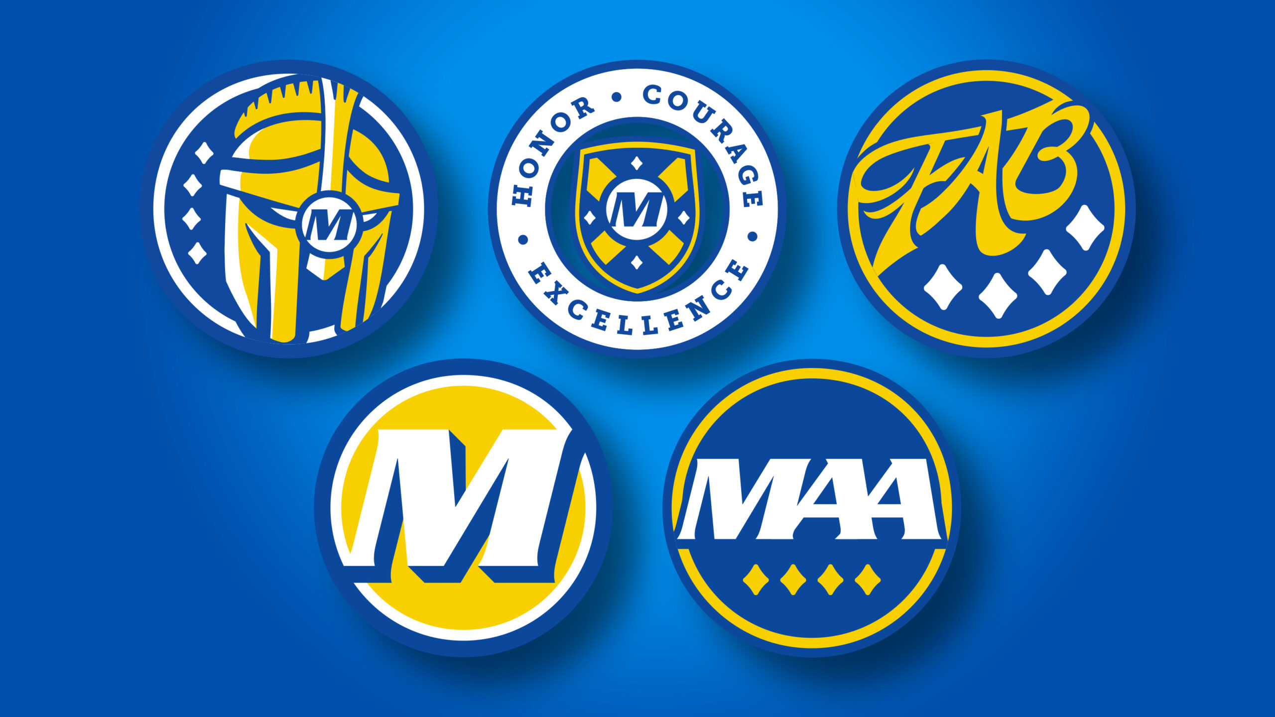
A central theme emerged: the Warrior as a bold protector—not a symbol of aggression, but of strength, bravery, and care.
We developed concept directions rooted in this idea, drawing from modern iconography, minimal illustration styles, and timeless design principles. An important insight also surfaced during this phase: the school district was composed of four distinct neighborhoods—a powerful metaphor for unity in diversity.
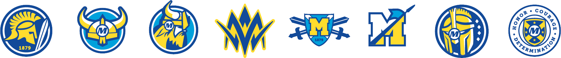
This idea inspired the creation of the four-diamond symbol, which became a cornerstone of the visual identity. Each diamond represented a neighborhood, and together they formed a strong, cohesive whole—mirroring the district’s community structure.
Result
The final brand identity is a vibrant, future-facing system that reinforces Mariemont City Schools’ commitment to academic, creative, and athletic excellence. Every element—from the typography to the mascot mark to the color palette—reflects the district’s core values:
-
Honor: Respecting the legacy and history of the district
-
Courage: Facing difficult conversations and change with integrity
-
Excellence: Striving for distinction in all pursuits
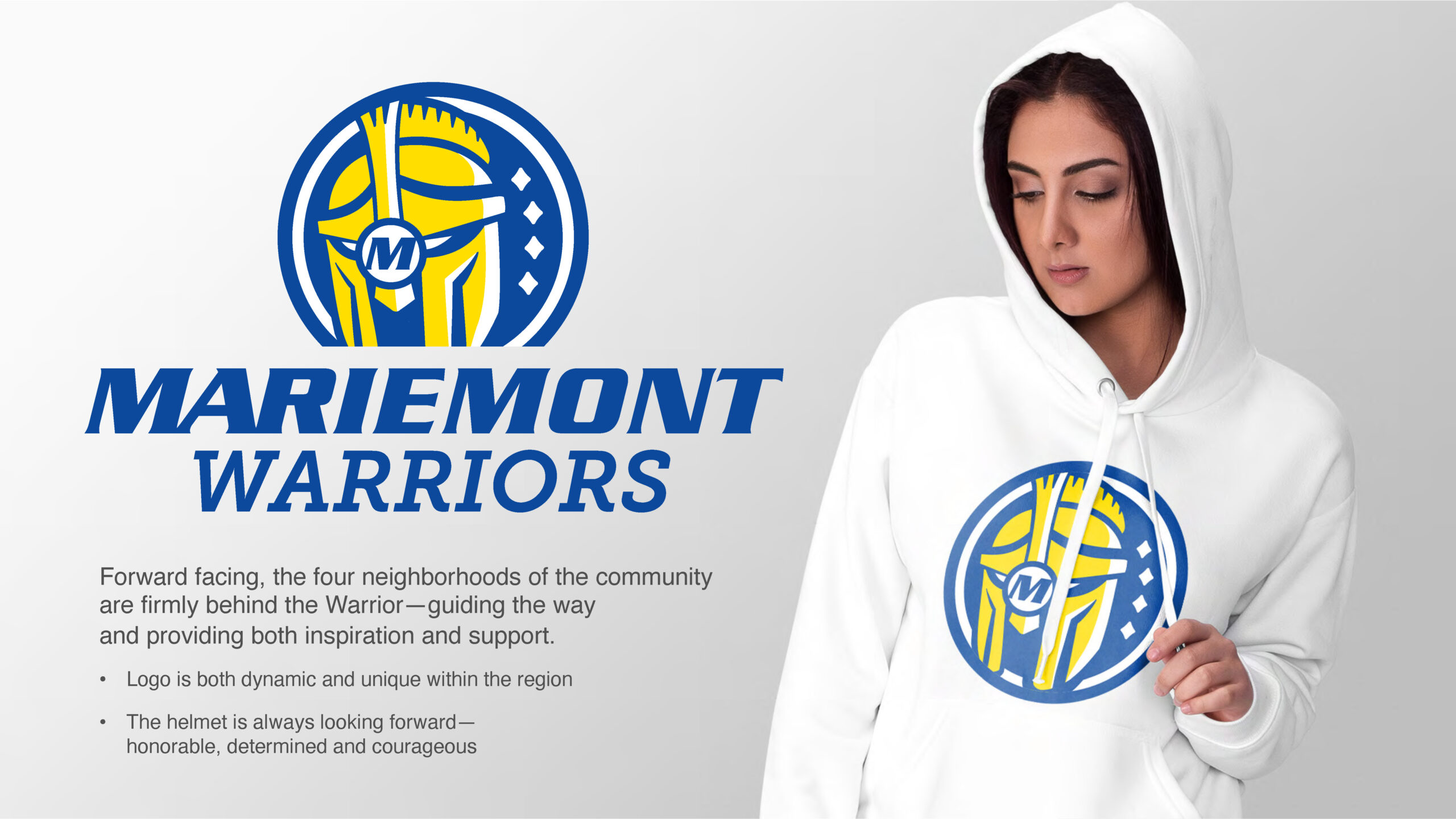
The four-diamond system ties the visual identity to the real fabric of the district’s geography and culture. It is deployed across uniforms, classrooms, athletic fields, digital platforms, and printed materials.
Community members, students, and faculty embraced the new brand with enthusiasm, recognizing that it was created withthem, not just for them.
“They’re the ones who will bring the brand to life—whether in academics, athletics, on social media, or in daily school pride.”
Conclusion
The Mariemont City Schools rebrand is more than a logo update—it’s a redefinition of identity through inclusive design and community-led storytelling. This project demonstrates my approach to thoughtful, strategic branding, especially when navigating sensitive challenges. And most importantly, it reflects how design can honor the past while building for the future.