I Appreciate the Opportunity to Do Meaningful Work
The work always comes before recognition. But over the years, I’ve been fortunate to have a few projects recognized by peers and industry organizations—acknowledgments that reflect collaboration, trust, and shared purpose. These moments reinforce the value of thoughtful design and purposeful branding, and I’m genuinely grateful for these opportunities and people behind them.
2025 American Graphic Design Awards Winner!
I’m excited to announce that recent pro bono work on the Mariemont Town Crier newsletter has been selected as 2025 American Graphic Design Awards Winner. The 62nd GDUSA annual showcase reflects graphic design’s power to shape and service to commerce and culture. The pieces showcased—and their creators—are among the best and brightest.

![]()

2025 Certificate of Appreciation!
I am honored to be recognized by the Mariemont Preservation Foundation with a 2025 Certificate of Appreciation for my contributions as a graphic artist and creative branding partner. This acknowledgment reflects a range of pro-bono projects supporting the Village, the School District and the Foundation, including the Centennial logos and flag, the redesigned masthead and logo for the Town Crier, the rebranding of the Mariemont School District Warrior, and the Passport Booklet for the Centennial Scavenger Hunt, along with many other collaborative efforts. It has been a privilege to help visually celebrate and preserve Mariemont’s history, identity, and community spirit.


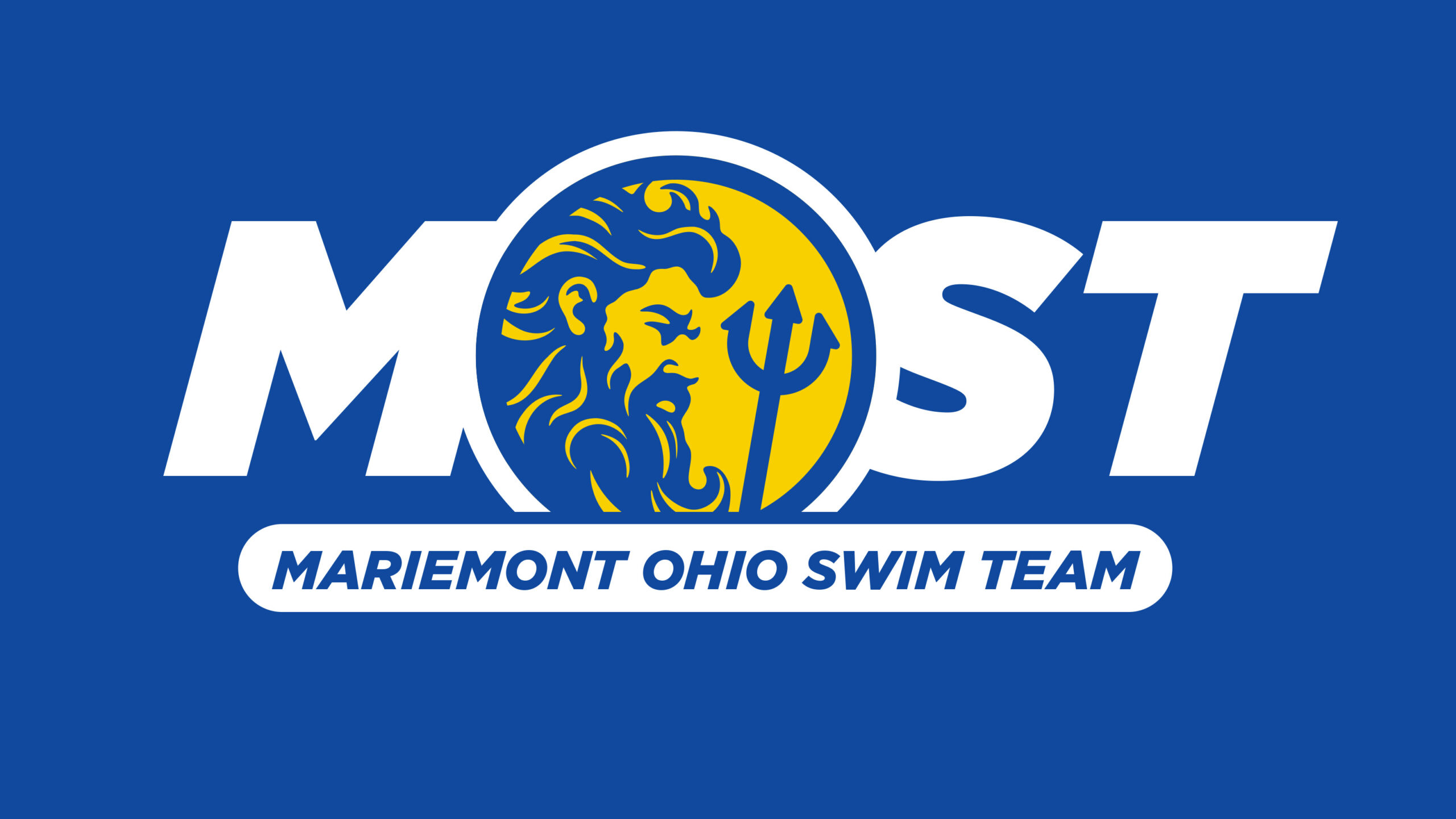
2025 LogoLounge Book 15 Winners!
From more than 30,000 submissions worldwide, only the best examples of global design excellence are chosen for inclusion in the iconic LogoLounge Book Series. The judging panel was chaired by Paula Scher, renowned designer from Pentagram. Once selected, winning logos were then compiled and showcased in the series, published both in print and digitally. I’m especially proud that the brand marks I created for the Mariemont Ohio Swim Team and the Mariemont Town Crier newsletter have been recognized among the LogoLounge Book 15 winners!


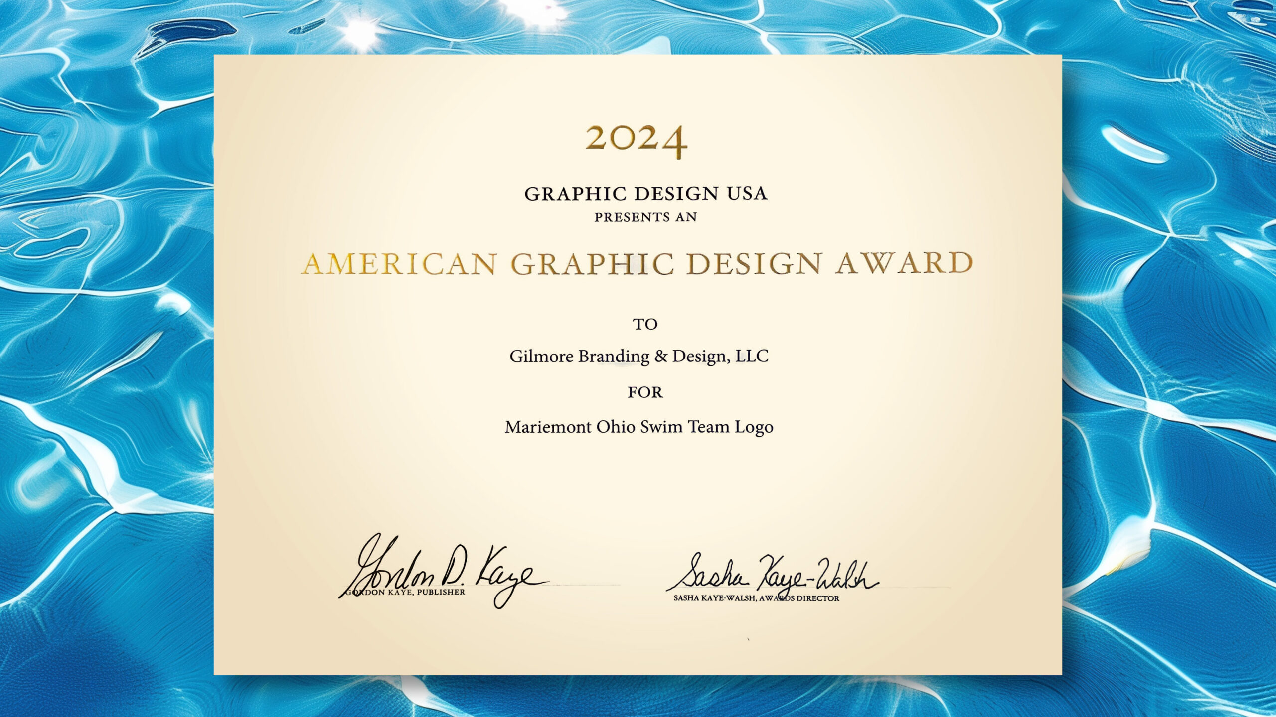
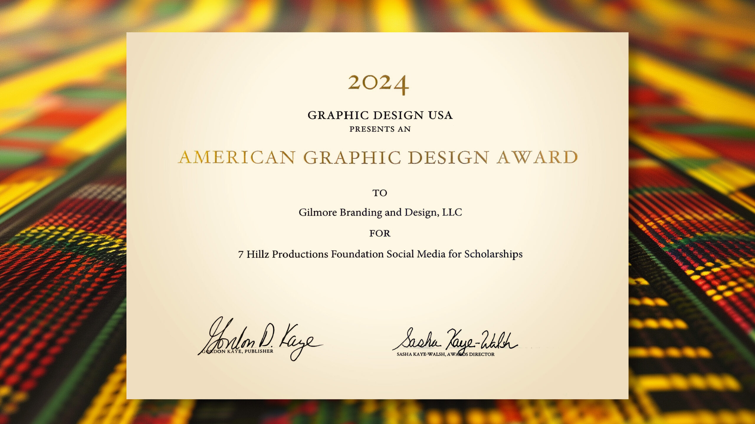
2024 American Graphic Design Awards Winners!
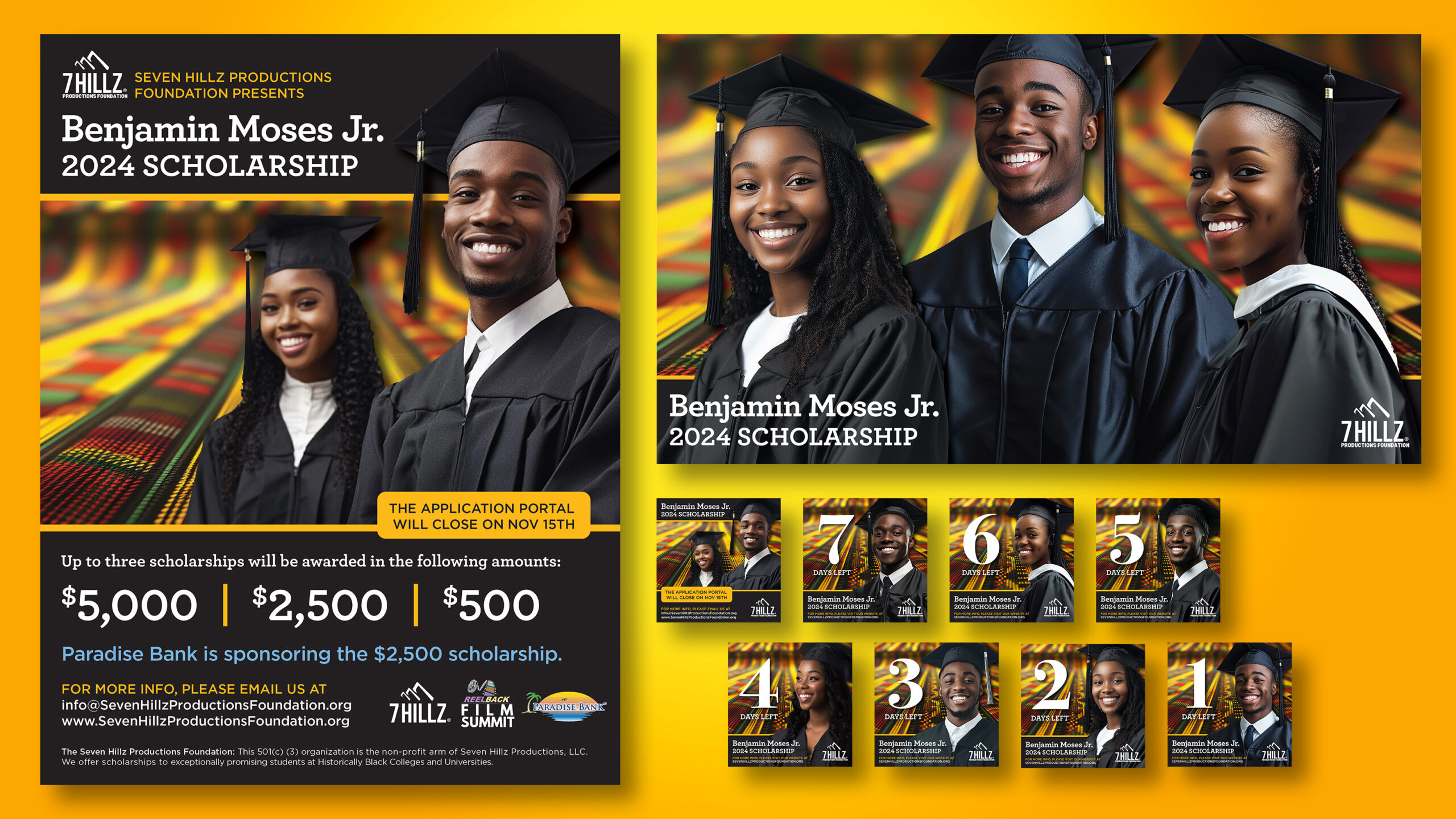
I’m excited to announce that recent work on two initiatives has been selected as 2024 American Graphic Design Awards Winners in the Designing For Good category. Both brand design work completed for Mariemont Ohio Swim Team (MOST) and pro bono social media campaign creative for a Historically Black colleges and universities (HBCUs) scholarship initiative for 7 Hillz Productions Foundation was recognized.
The Designing For Good category, encompasses graphic communications that advance positive social and environmental action and social justice impact; promote diversity, equity and inclusion; and aim to make communities and the world a better place for people and nature.
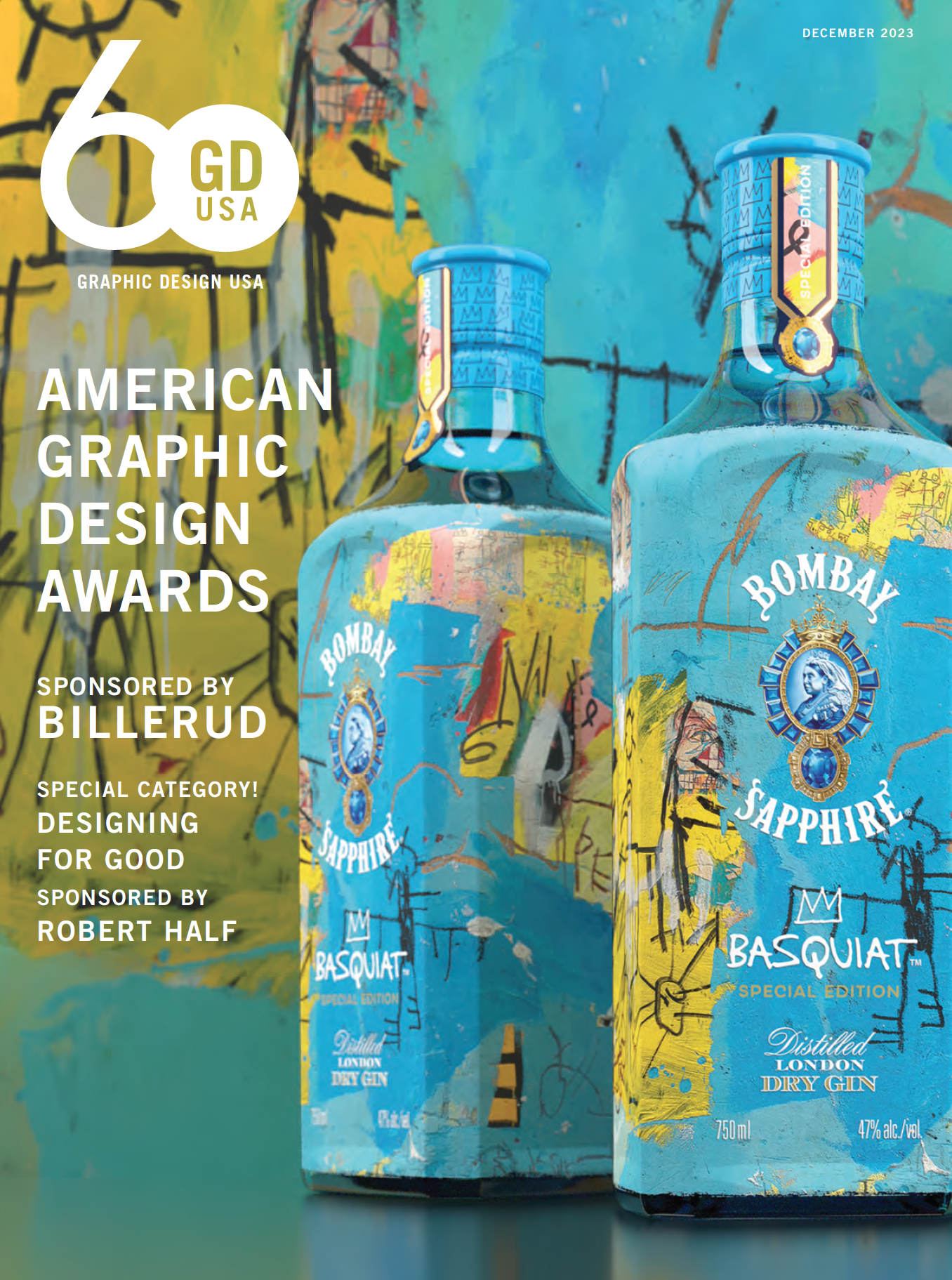
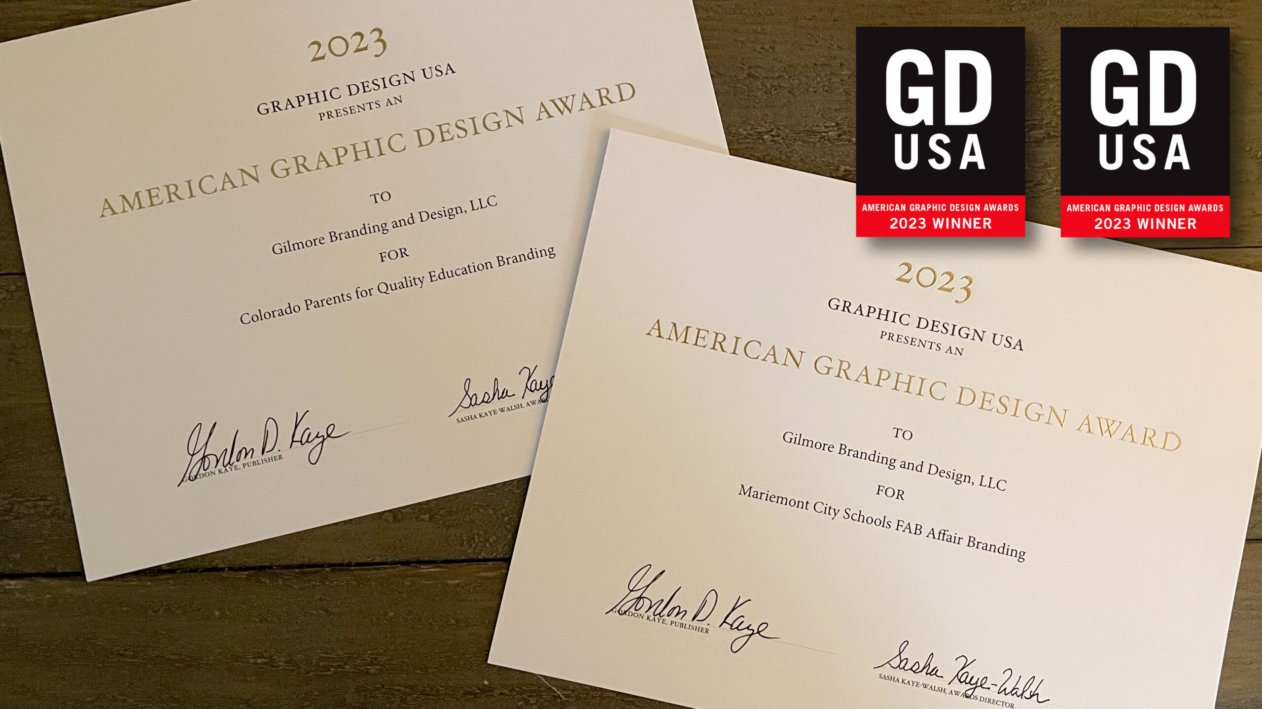
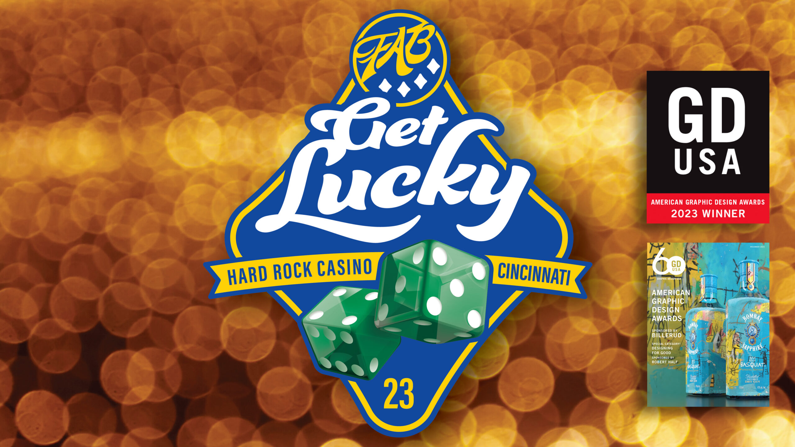
2023 American Graphic Design Awards Winners!
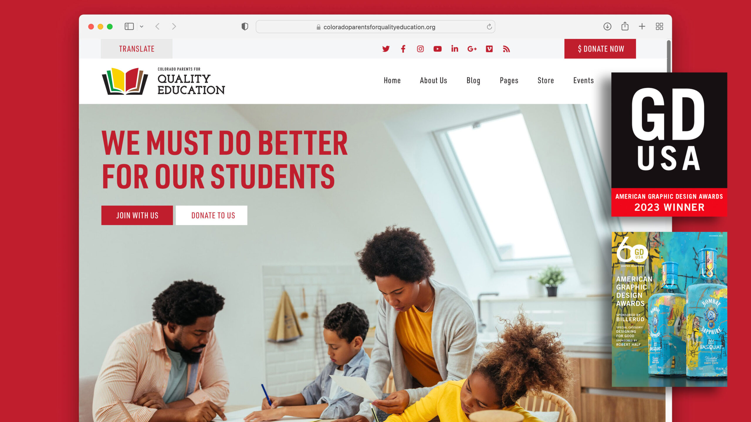
I am excited to announce that my pro bono work with Colorado Parents for Quality Education and Mariemont City Schools 2023 FAB Affair has been selected as 2023 American Graphic Design Awards Winners in the Designing For Good category.
The 60th GDUSA anniversary showcase reflects graphic design’s shape and service to commerce and culture.
The Designing For Good category, encompasses graphic communications that advance positive social and environmental action and social justice impact; promote diversity, equity and inclusion; and aim to make communities and the world a better place for people and nature.
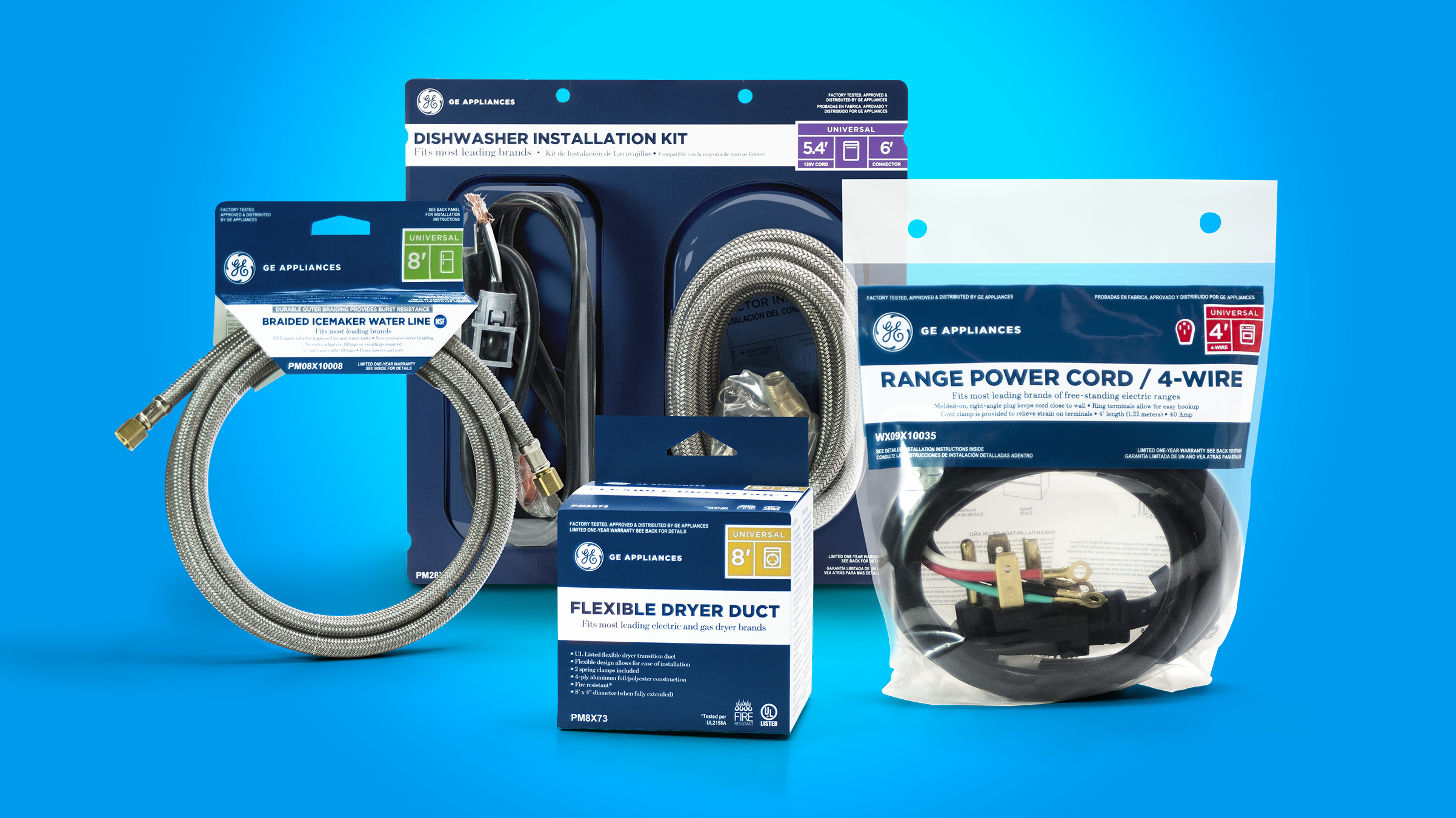
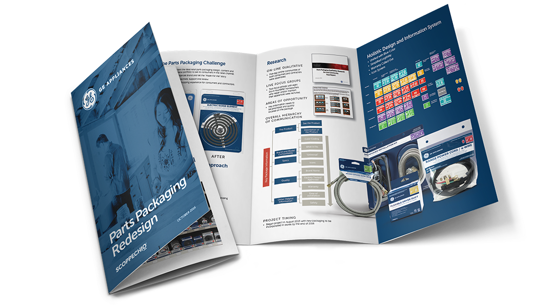
2016 American Package Design Awards Winner!
GE Appliance Parts Packaging Redesign Wins in Research, Retail and Industry
Work on the redesign of GE Appliance Parts Packaging has been recognized by Graphic Design USA with a 2016 American Package Design Award—within the Home, Garden and Industrial category.
The annual GDUSA competition celebrates well-designed graphics and the power of package design to create emotional links with the shoppers at the moment-of-truth.
The redesign—of over 80 products—focused on creating an overall brand block of packaging at shelf and enhancing shop-ability with an entirely new information and iconography system. The project was taken in front of consumers on two occasions—a week long Internet community with both consumer and contractors providing feedback on early concepts, as well as a series of focus groups to better understand package communication and brand value.


2009 LogoLounge Book 5 Winner!
![]()
The fifth volume in the best-selling LogoLounge series brings together an exciting collection of 2,000 totally new logos from designers worldwide submitted to the largest collection of logo designs in the world. In addition to being included in LogoLounge Book 5, the monogram of my initials was also included in LogoLounge Master Library Volume 1.

2008 Advertising Age Contributing Source on Sustainability
Unilever sees green with pared-down color palette
Advertising Age | Contributing Source | By Jack Neff | December 01, 2008
Somewhere over the rainbow lies $5 billion in savings for the package-goods industry.
Using a color-harmonization program called Project Rainbow, Unilever is reducing the more than 100 hues it uses on its spreads and dressings packaging in Europe to six. Unilever’s hope is to save tens or eventually even hundreds of millions of dollars a year. By some estimates, the entire industry could save $5 billion annually if it follows suit.
LFH, the branding and design group behind the switch, said the initial savings for Unilever in Europe amount to $13 million to $26 million. Graham Hawkins, production director of LFH, said other package-goods companies are expressing interest, and said savings from color reduction could be applied to other areas of marketing.
But will consumers notice the fewer colors?
“The jury’s still out with some brand managers, some design managers, as to whether there’s any sort of aesthetic cost,” said Thomas Gilmore, director-brand strategy for the Cincinnati-based branding and design firm RGI, who has worked with marketers such as Procter & Gamble Co. and Kimberly-Clark Corp. “But it’s certainly a trend you see, and it’s on, I think, most every design manager’s list of things to think about.”
In the current economic climate, he said, it’s becoming a far more attractive option, enough so that he believes even brands that do see a significant difference will consider it. “Brand managers see what else they can do with that money in their budgets,” he said. “It’s money that could be used for a website or an in-store promotion or any number of things.”
Advancements in printing, which have added as many as four additional colors to the old four-color process, have helped make such moves possible, reducing the need for specialized or “spot” colors to get the right look — or close to it.
There’s even a potential environmental benefit. Mr. Gilmore, who founded the Sustainable CPG forum on LinkedIn, notes considerable reductions in waste from such consolidations. Cost savings and waste reduction come from buying inks on a greater scale, creating far less ink and packaging waste in the process of doing changeovers, and from producing final packaging because reduced complexity can improve quality and consistency, Mr. Hawkins said.
A few companies have adopted more-generic lineups of standardized colors, Mr. Hawkins said, but he believes quality suffers in comparison to the customized system Unilever adopted. LFH used a patented system by which it audits colors used by a marketer and then recommends a reduced palette that can achieve nearly the same look.
“Basically, eight out of 10 marketers couldn’t tell the difference between their old packaging and the new packaging once we converted it,” Mr. Hawkins said. The other two didn’t see enough difference to justify the added cost for more inks, he said.
“The team was, quite frankly, blown away with the results,” said Matthew Daniels, best-practices manager for the Unilever spreads and cooking business, in a statement. “No one could quite believe that such quality could be realized when using six colors.”
But the approach isn’t for everyone. Savings are much bigger for the largest, most diverse package-goods companies with the most complexity in their packaging lineups.
