Global Identity Management
As Senior Brand Identity Manager at leading Omnicom brand consultancy Interbrand, I led efforts on a number of branding, promotional and global packaging initiatives for Procter & Gamble’s Charmin Bathroom Tissue.
Without a doubt, I loved supporting the Charmin brand. The marketers and design team at P&G not only wrote the book on the fundamentals of building a brand, they taught me more than a thing or two about collaboration. Amazing to think of the power of marketing to differentiate within a category of products—quite literally flushed down the toilet. Most people have very little choice throughout their day—at the office, at school or in a restaurant—but can be tremendously loyal with their dollars.
Building Visual Consistency
Procter & Gamble’s design180 allows brands to develop methods and tools to express their Equity Building Choices and Design Theme globally within Procter & Gamble and extended creative community.
This web based tool saves time and money by helps brands maintain visual consistency across the many touchpoints of a brand’s communication. The website also provides insight behind the strategies used to describe the positioning of the Charmin brand as well as a history of the brand and overview of current competitive communication methods.
 The Charmin website offers practical guidelines for producing graphic communications and explains the rationale behind the choices that have been made. It is not intended to limit creative development, but rather leverage proven elements that raise awareness, drive trial and build equity for the Charmin brand. The guide should be used as a “litmus test” while developing creative executions to ensure that efforts are delivering clarity and consistency.
The Charmin website includes:
- Strategic Framework
- Executional Guidelines
- Brand Assets
- Packaging
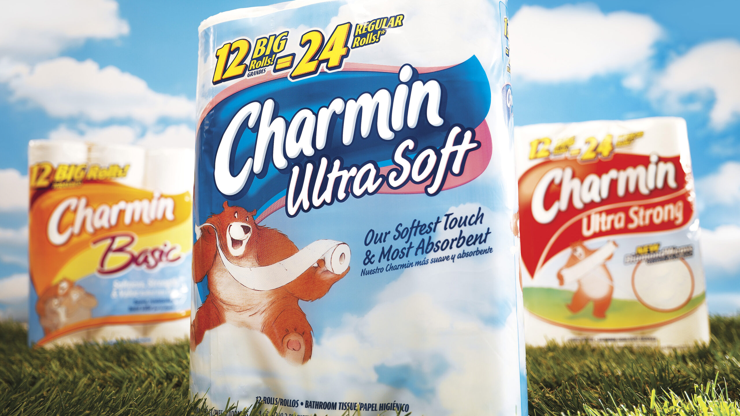
Walmart Retro Packaging
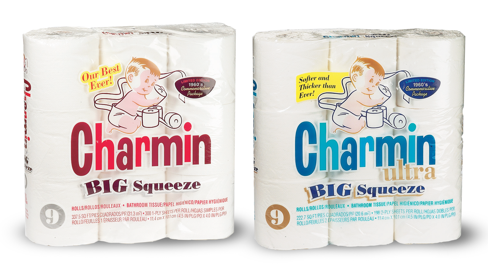
In 1928, the Hoberg Paper Company of Green Bay, Wisconsin began manufacturing a new brand of bathroom tissue. Upon reviewing the initial product, one employee described the packaging as “charming.” Later that year the brand name “Charmin” was officially registered by the company.

The original packaging was designed to appeal to the female shopper. It borrowed from the fashions of the day and was produced in a light blue color meant to resemble a formal ball gown. The package included a silhouetted face of the “Charmin Lady” and used script lettering style taken from a hat box.
With the product’s remarkable success, the Hoberg Company changed its name to the Charmin Company in the early 1950s. And in 1958, the company was acquired by P&G.
Since the acquisition, Charmin has become a mainstay for many consumers and one of P&G’s esteemed billion dollar brands. It has been the best-selling brand of bath tissue in the US for more than 20 years and continues to drive innovation within the bath tissue category.
Global Packaging Print Quality Review
An ongoing program with Charmin Bathroom Tissue was initiated to provide both insight from packaging production and demonstrate brand leadership on a global scale. The project objective was positioned to help deliver consistent global print quality, visual equity and open discussion to design strategy choices.
This positioning links final production of one project with initial strategy of the next.
The initial survey covered North America (US). The extended review focused on Western Europe (UK and DACH). Subsequent reviews covered Mexico and Canada as well as an ongoing global review and comparison. The scope of the project could also be expanded to include point-of-purchase and marketing materials.
 Preliminary research covered regional product retrieval and in-store observations. Buyers from Mintel were given specific direction. Products were obtained based on four criteria:
- Location
- Retail Environment
- SKU Representation
- Print Quality
Packages were examined to better understand the distinct concerns confronting the brand in each region. Additionally, observations were made between the regions to enhance print quality and pinpoint areas of opportunity for consistency in graphic equities as well as strategic considerations. Items and retailers were reviewed and photographed as a matter of record for present and future comparisons.
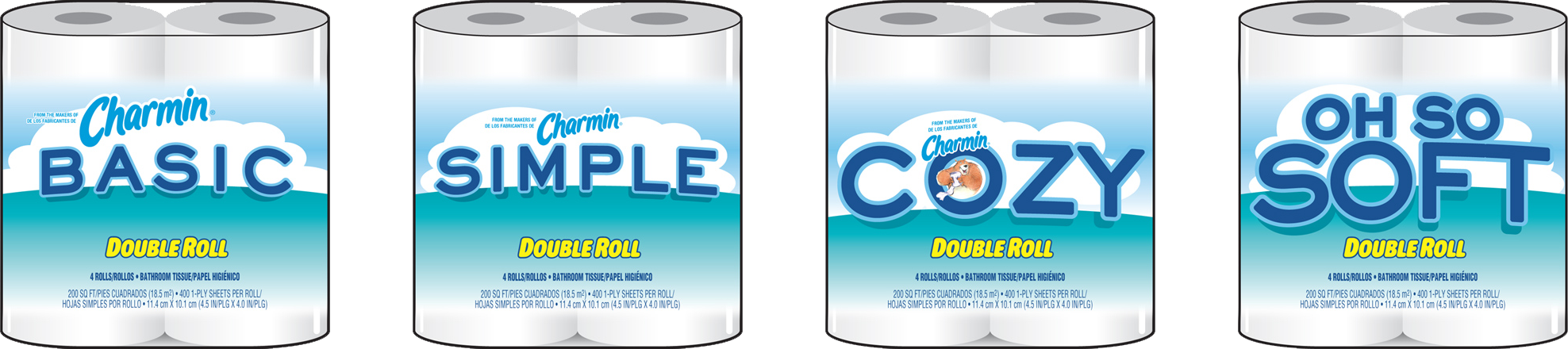
Charming Basic Concepts